
Practical responsive image sprites for the web
Published on:An image sprite sheet is a collection of images combined into one, so that browsers don’t need to request each image separately.
How does one create a sprite sheet?
And how can we measure any potential benefit?
What problems can appear and how do we work around them?
This post features screenshots from pdx.tools. Game assets shown are from EU4 and are for illustrative purposes only, and have not been officially authorized.Creating a sprite sheet
Let’s create our first image sprite. For a motivating example, imagine a view where the user sees all downloadable content (DLC) for the game, and if the user doesn’t have a given DLC enabled, a grayscale filter is applied.
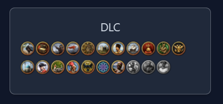
What DLC the user has enabled
Each DLC icon is an image, so we’re looking at 21 images. And all of these images are displayed every time.
We can package these 21 images as a single image with the help of a ImageMagick montage.
montage -background transparent -mode concatenate dlc-images/* output.png
Which will spit out:
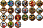
Montage output
Well, the output won’t be the literal image seen above, as this blog optimizes images into several formats, but I think you get the gist.
File size optimizations
Before we get to integrating our montage into our application, let’s take the opportunity to encode our montage into additional formats like the newer and more optimized WebP format.
# Generate a lossless WebP image sprite
montage -background transparent -mode concatenate -define webp:lossless=true  dlc-images/* output.webp

# Generate a lossy, but high quality WebP image sprite
montage -background transparent -mode concatenate -quality 90 dlc-images/* output-q90.webp
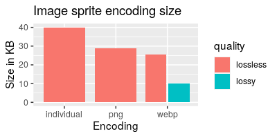
How do the file sizes compare? Glad you asked.
Comparison in bytes to serve all images
The graph shows that just packaging the images together into a single PNG results in 25% fewer bytes of bandwidth. So even giving the benefit of the doubt that HTTP 2 and 3 browsers and CDNs can handle 21 requests as efficiently as 1 request, the sprite sheet still gives a solid win.
One can intuit that the bandwidth savings from the sprite sheet comes from the lossless compression scheme taking advantage of similarities between sprites.
The lossy encoding, though. That takes the cake. 75% smaller, with no perceptible differences. It’s the one I’d decide on.
Keep in mind, your mileage will vary! In our first example, the lossless WebP sprite sheet showed only a slight improvement to the PNG, but in testing other images, the lossless WebP achieved up to a 60% smaller output over a well-optimized PNG. If you’re only targeting browsers from the last four years, you should migrate PNG to WebP, as it is practically unheard of for the conversion to WebP to result in a bigger file.
If we had all day, we could throw in the AVIF and JPEG XL image codecs into the mix (both lossy and lossless variants). It would be a lot of fun.
But I must tell you about the drawbacks to the sprite sheet we just created.
When a new DLC comes out, or we need to edit a single icon, the sprite sheet is cache busted, and the client needs to redownload the whole sprite sheet again instead of just the new or edited icon. Considering DLCs are released about twice a year, and I’ve never edited these images – it’s safe to say these drawbacks are well worth it.
Further in this post, we’ll see other drawbacks that actually pack a punch.
Deterministic Tiling
ImageMagick arranged the montage in a 6x4 grid. How did it decide on that arrangement? It’s neither the most optimal in terms of eliminating wasted space (that award goes to 7x3), nor the most square, which would be 5x5.
ImageMagick documentation lists the output grid dimensions for up to 48 images. I guess it is hard coded.
We need something better, something generic and deterministic in order to simplify client side computations.
The question we need to solve is, given n squares of identical size, what is the formula for the dimension of a square-ish container (allowing for a side to differ by 1) that can hold all n? To give examples from 16 to 25:
n=16=4x4n=[17,20]=4x5n=[21,25]=5x5
The answer is shown below:
N=$(ls dlc-images | wc -l)

# cols = ⌈√n⌉
COLS=$(echo $N | awk '{s=sqrt($0); print s == int(s) ? s : int(s) + 1}')

# rows = ⌈n/cols⌉
ROWS=$(echo "$N $COLS" | awk '{s=$1/$2; print s == int(s) ? s : int(s) + 1}')

# Specify tiling
montage -tile ${COLS}x${ROWS} -quality 90 -background transparent -mode concatenate  dlc-images/* dlc-sprites.webp
In reality, specifying $ROWS is optional as ImageMagick can infer the optimal rows using the same formula we came up with.
Creating a lookup table
With our sprite sheet created, we now need to create a lookup table for the image index in the sprite sheet. You can create the lookup table how you want, but since we’re talking about the web, I prefer a JSON lookup table where the image’s basename is mapped to a one dimensional index. Two dimensional is fine as well, but one dimensional cuts down on the amount of data.
Our lookup table can be created with a couple lines of bash + jq.
while IFS= read -r item; do echo "${item%%.*}"; done < <(ls dlc-images/) | \
jq --compact-output --raw-input --null-input \
  '[inputs] | to_entries | map({(.value): .key}) | add' > dlc-sprites.json
The output JSON will look something like:
{
    "106_s": 0,
    "10_s": 1,
    "110_s": 2
}
It is absolutely critical that the images used in the montage and lookup table are iterated in the same order. I’m paranoid, and sort directories and then reference the same list in both operations, so I guarantee they stay in sync.
Writing client side code
We’ll take a cue from MDN’s Implementing image sprites in CSS and instead of writing our client side code to use the img element, we use background-image and background-position.
Referencing the individual images in our web application takes some finesse, but it’s doable. Probably the hardest part will be ensuring the build system understands to digest the sprite sheet and return the url, while importing parsed JSON. Depending on your setup, it can already be supported or a major head scratcher, so I’ll wave over this problem and skip right to implementing a React component (but it should be easy enough to translate to your framework of choice).
import imageUrl from "./dlc-sprites.webp";
import data from "./dlc-sprites.json";

const IMG_WIDTH = 24;
const IMG_HEIGHT = 24;
const cols = Math.ceil(Math.sqrt(Object.keys(data).length));

function DlcIcon({ dlcId }: { dlcId: number }) {
  const index = data[`${id}_s`];
  const row = Math.floor(index / cols);
  const col = index % cols;
  return (
    <div
      role="img"
      aria-label={`${dlcId} (enabled)`}
      style={{
        width: IMG_WIDTH,
        height: IMG_HEIGHT,
        backgroundImage: `url(${imageUrl})`,
        backgroundPosition: `-${col * 100}% -${row * 100}%`,
      }}
    />
  );
}
- We need to set an explicit height and width on the containing
divas a background doesn’t influence the size of an element. - The DLC sprite ID argument is translated into the 1D sprite index and then into a 2D index.
- The background positioning seems strange, you’ll see values like
-100% -200%. How I internalize it, is the browser will take ourdivwidth of 24px, multiply it by 100% (so, 1), and subtract that from the left edge to find the pixel offset of the column with the image we’re interested in. Do the same with height to get the coordinates of our desired image. MDN has a great section on this. If directly using pixel coordinates is your jam, that option will work too. - The reason that
aria-labelis used instead of something like a screen reader only class, is an accessibility guide site pointed out that the contents could be the image (imagine ASCII art), soaria-labelshould make it unambiguous that the label isn’t the image. - If the image is purely decorative, we probably wouldn’t mark the role as an
imgas it appears that a blank aria label is not valid for an img role.
Alternative lookup with CSS
If you’d rather package up the lookup table as CSS instead of JSON (and I wouldn’t blame you), you can generate CSS with the following command:
# Insert bash script where we calculated ROWS and COLS
cat << EOF > output.module.css
.dlc-icon {
  width: 24px;
  height: 24px;
  background-image: url(./dlc-sprites.webp);
}
EOF

while IFS= read -r item; do echo "${item%%.*}"; done < <(ls dlc-images/) | \
  awk -v COLS=$COLS '{
    ROW=int((NR - 1) / COLS);
    COL=((NR - 1) % COLS);
    print ".dlc-icon-" $0 "{ background-position: -" (COL * 100) "% -" (ROW * 100) "% }"
  }' >> output.module.css
It will spit out our CSS sprites:
.dlc-icon {
  width: 24px;
  height: 24px;
  background-image: url(./dlc-sprites.webp);
}

.dlc-icon-110_s{ background-position: -300% -0% }
/* ... snip ... */
You’ll want to double check that your build system is properly digesting our url reference so we can take full advantage of caching (Next.js will, for the record).
The pros with the CSS approach is that our component is now simpler and more efficient (omitted for brevity). No need for inline styles, just a reference to the desired class is all that is needed now.
The generated CSS starts much larger than our JSON lookup, but after compression (brotli or gzip), the gap narrows to around twice the size of the JSON. Considering our component is smaller and more efficient with CSS, I’d say that it is a wash between the two (and I’d rather not get into whether it is faster for the browser to parse JSON vs CSS).
A mixture of both techniques is effective too: define the static bits in CSS with background positioning from the JSON lookup table. As a bonus, the JSON lookup table provides a cleaner way to check if user input exists, and unless you are using CSS modules it is harder to accomplish the same with CSS.
Leveling up with responsive sprites
We may find ourselves needing to display a 64x64 image sprite in a 48x48 box. Below is how we can write a component to do this.
In addition to needing to know the total number columns that exist in the image sprite, we need to derive the total number of rows as well.
const total = Object.keys(data).length;
const cols = Math.ceil(Math.sqrt(total));
const rows = Math.ceil(total / cols);

export function Sprite({ src, ariaLabel, width, height }) {
  const row = Math.floor(index / cols);
  const col = index % cols;
  return (
    <div
      role={ariaLabel ? "img" : "presentation"}
      aria-label={ariaLabel}
      style={{
        minWidth: width,
        minHeight: height,
        maxWidth: width,
        maxHeight: height,
        backgroundImage: `url(${src})`,
        backgroundPosition: `-${col * 100}% -${row * 100}%`,
        backgroundSize: `${cols * 100}% ${rows * 100}%`,
      }}
    />
  );
}
background-size makes an appearance. If we have a sprite that is an image grid of 5x4, our background size would be: 500% 400%. These percentage values were a bit of a head scratcher until I realized it’s similar to background-position. We’re letting the browser use the rendered dimensions of our div to compute what the dimensions the background image should be resized to.
If this is not intuitive, background-size accepts pixel dimensions so you can run the computations yourself (ie: ${cols * width}px).
Also making an appearance in our example are explicit min and max dimensions. It is absolutely critical that our div is a certain size for our calculations to work, otherwise you’ll see bizarre subsections of the background image. You can thank flexbox for this (and a dash of paranoia from this actually happening in production).
Resolution
Another form of responsiveness is serving higher resolution images to higher resolution displays. One way to accomplish this is by specifying a pixel density descriptor, also known as an “x” descriptor, for an img srcset, where the browser fetches what image they think will work best.
<img alt="" width="300" height="300" src="./image.webp" srcset="
  ./image_1.25x.webp 1.25x,
  ./image_2x.webp 2x,
  ./image_4x.webp 4x
">
Though we aren’t using img elements, we can accomplish the same by moving our background-image from an inline style to CSS and use the new image-set() function.
.sprite {
  /* fallback in case image-set not supported */
  background-image: url(./image.webp);

  /* Prefixed version as 8% of browsers still need it
     https://caniuse.com/css-image-set */
  background-image: -webkit-image-set(
    url(./image.webp) 1x,
    url(./image_1.25x.webp) 1.25x,
    url(./image_2x.webp) 2x,
    url(./image_4x.webp) 4x
  );

  background-image: image-set(
    url(./image.webp) 1x,
    url(./image_1.25x.webp) 1.25x,
    url(./image_2x.webp) 2x,
    url(./image_4x.webp) 4x
  );
}
It’s a bit more CSS than I like, but it’s much better than any workaround to coax React to accept vendor prefix inline styles. I spent 15 minutes trying out workarounds until I solved the CSS duplication problem by introducing a custom property.
If you struggle with understanding the decision process of what pixel density descriptor a browser will choose from a given list, don’t worry I do too! That’s why I made XPick so you can play around with giving the browser different options and seeing how it reacts. Try it out! I had no idea that there were major differences in what browsers choose.
Blur up
After publishing high resolution sprites, our next problem is that clients best able to take advantage of these high resolution sprites (ie: phones), are often the most ill suited in terms of bandwidth and latency to load these much larger files.
A very effective solution is to create an image sprite for “blur-up”. We create a montage of images that are resized to an extremely small size, like 8x8 or smaller, and then resize them back to their intended resolution.

Original image next to its blurred up counterparts
There are two blurred candidates with a subtle but important visual difference. The one on the right looks worse as it suffers from neighboring sprites bleeding onto it. To achieve the middle result, create a montage of individually resized 8x8 images instead of resizing after the montage is created. The bleed in the right image can be mitigated by trying out different scaling algorithms like nearest neighbor, but image quality seems to drastically reduce.
The blurred image can be 20x smaller and gives first time users, a sense of what is being loaded. Even those who have the full-sized sprite sheet cached benefit from a blur-up while their browser has to read the much larger file from disk and decode it.
The implementation is conceptually simple. Create a container with two elements stacked on top of each other with the blurred element behind the real one.
.sprite-blur {
  background-image: url(image-blur.webp);
}

.sprite {
  /* unchanged */
}
Our component gains a few more lines of code, but it’s not too bad.
const total = Object.keys(data).length;
const cols = Math.ceil(Math.sqrt(total));
const rows = Math.ceil(total / cols);

export function Sprite({ ariaLabel, width, height }) {
  const row = Math.floor(index / cols);
  const col = index % cols;
  const style = {
    position: "absolute",
    inset: "0",
    backgroundPosition: `-${col * 100}% -${row * 100}%`,
    backgroundSize: `${dimensions.cols * 100}% ${dimensions.rows * 100}%`,
  } as const;

  return (
    <div
      style={{
        position: "relative",
        minWidth: width,
        minHeight: height,
        maxWidth: width,
        maxHeight: height,
      }}
    >
      <div
        className="sprite-blur"
        style={style}
      />
      <div
        role={ariaLabel ? "img" : "presentation"}
        aria-label={ariaLabel}
        className="sprite"
        style={style}
      />
    </div>
  );
}
You can take this technique farther for the most extreme scenarios. Just add another layer that consists of blurred up 1x1 images that is base64 encoded into the stylesheet.
Bloat and access patterns
If not all images in a sprite sheet are used simultaneously, there is a risk of bloat.
There are a few ways to define bloat. Those that are aggressive may say that there is bloat if, at any time, the sprites displayed on a page would have been more optimal to load individually. I prefer to look at the whole user journey, but I can sympathize with the emphasis on first impressions.
The blur up technique eliminates most of the possibilities for bloat, but large, underutilized sprite sheets are still susceptible. The bandwidth that could be spent loading critical resources is instead wasted on unused images.
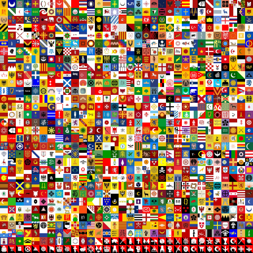
Flag image sprite and not all flags will be used
We can reduce the amount of bloat by exploiting access patterns.
Take the flag image sprite above. There could be a long tail where 10% of the flags account for over 90% of requests. At 10% of flags, that’s 100 flags, which sounds like a lot, but the savings would be immense. In a quick smoke test, a montage of 100 randomly selected flags resulted in a 91 KB file, a tenth of the original. Then instead of a single sprite sheet, create two – one hot and one cold.
I find it somewhat ironic that it’s easier to identify access patterns when serving individual files, as these requests are likely to show up in an access log that can be queried. So before migrating to sprite sheets, consider interrogating data for insights.
In my case, I was able to export analytics from Vercel and found out:
- 400 flags made it into the top 1000 requests
- The top 100 flags comprise 55% of requests to these 400 flags
- The top 200 flags comprise 77% of requests to these 400 flags
- The top 300 flags comprise 91% of requests to these 400 flags
Not as dramatic of a long tail that I originally painted, but creating tiered sprite sheets is still a big win in my book, as it seems very real that image sprite bandwidth (and its impact on loading times) could be cut by two-thirds.
Going forward in an image sprite world, insights can only be gained by capturing this information client side and shipping it to a server somewhere, and I don’t think my users are consenting to that. Or maybe it doesn’t matter. Just slap a cookie banner and call it a day, am I right?
Perhaps this gives me an excuse to check out more featureful application analytics platforms like Posthog.
Either way, when there is a game update and new flags are added, a decision must be made without data. Are these flags added to the hot file or not? Is the hot and small file preferable to cache bust to the cold and large one? Or if no pre-existing flags received modifications in the update, would it make sense to create a third file: a sprite sheet of only new flags as a form of delta encoding? These are all intriguing questions, to the extent that I think no answer is wrong or right, or at least the difference between potentially optimal and suboptimal solutions are not worth an in-depth discussion here.
An alternative and thought provoking technique to work around potential bloat at the cost of complexity, is to batch flag component rendering, such that we count how many are needed and branch accordingly. If many flags are needed, then load the flag sprite sheet, otherwise load the images individually.
Additional performance improvements
If you find yourself in a situation where sprites are rendered at the bottom of the page, you’ll see that the background image is eagerly loaded. Background images don’t have the equivalent builtin lazy loading that img elements do, so you’ll have to roll your own with an intersection observer as demonstrated in this article.
Another optimization thought: what benefit is there to re-arranging the images so similar flags are next to each other? For instance, group the flags with white backgrounds in a cluster together. I have a hunch that would compress better.
I want to sound impressive and suggest something along the lines of k-means clustering along red, green, blue, white, and black lines, but I don’t know what that means. Not to mention I feel like flags make heavy use of opposite colors equally to increase contrast, and that would defeat most gains from compression. Vexillologists, I await your input.
Creating a sprite sheet from differently sized images
What if we want to create an image sprite sheet of icons that vary in size?
ImageMagick will pack them together well enough.
montage -mode concatenate -background transparent *.png icons.webp

Montage of images with varying dimensions
But now we can’t use our JSON lookup table technique as an image’s index won’t give us a deterministic location.
The solution is to resize all the icons to the biggest icon in the montage. In this case, it’s 32x32.
montage -mode concatenate -geometry '32x32>' -background transparent *.png icons.webp
The trailing > on geometry may seem like a mistake but it allows us to place a smaller icon within the desired space without touching the image and making it blurry. Said another way, each image keeps its size but is now placed on a 32 by 32 canvas and results in:

Montage of differently sized images each on a 32x32 canvas
Remember when I said there was no distinction between absolute and percentage based values for background-position? With differently sized images, the image sprite sheet might be a grid of 32x32 squares, but we want to display a 27x27 icon within a 27x27 square. We no longer can use percentages as our div container won’t be representative of the rest of the background image.
const total = Object.keys(data).length;
const cols = Math.ceil(Math.sqrt(total));
const rows = Math.ceil(total / cols);

const spriteCellWidth = 32;
const spriteCellHeight = 32;

export function Sprite({ iconWidth, iconHeight }) {
  const row = Math.floor(index / cols);
  const col = index % cols;
  const startx = col * spriteCellWidth;
  const starty = row * spriteCellHeight;
  return (
    <div
      style={{
        width: iconWidth,
        height: iconWidth,
        backgroundImage: `url(${imageUrl})`,
        backgroundPosition: `-${startx}px -${starty}px`,
      }}
    />
  );
}
And to cap everything off: if we wanted to display the differently sized image at … a different size, we need to add a scaling factor to compute the absolutely positioned background-size and background-position.
export function Sprite({ iconWidth, iconHeight, scale }) {
  const row = Math.floor(index / cols);
  const col = index % cols;
  const startx = col * spriteCellWidth * scale;
  const starty = row * spriteCellHeight * scale;
  const sizex = cols * spriteCellWidth * scale;
  const sizey = rows * spriteCellHeight * scale;
  return (
    <div
      style={{
        width: iconWidth * scale,
        height: iconHeight * scale,
        backgroundImage: `url(${imageUrl})`,
        backgroundPosition: `-${startx}px -${starty}px`,
        backgroundSize: `${sizex}px ${sizey}px`,
      }}
    />
  );
}
If image sprites of varied sizes is a common occurrence, I recommend getting comfortable with absolutely positioned values!
object-position, a better alternative?
Through this article there’s been struggles as we tried shoehorning accessibility, pixel density descriptors, lazy loading, and blur up into sprites displayed with a background-image. What if I told you there is a way to communicate sprites with the native img element coupled with object-position and all you need to do is read Spriting with <img> from CSS-Tricks?
I wouldn’t blame you for being upset.
With that in mind, let’s see a kitchen sink example that shows how well this technique handles all the problems we’ve seen so far.
export function Sprite({ width, height }) {
  const row = Math.floor(index / cols);
  const col = index % cols;

  return (
    <div style={{width, height, position: "relative"}}>
      <img
        alt=""
        width={spriteCellWidth}
        height={spriteCellHeight}
        loading="lazy"
        src="./image.webp"
        srcSet={["./image_1.25.webp 1.25x", "./image_2x.webp 2x"].join(",")}
        style={{
          position: "absolute",
          transformOrigin: "top left",
          transform: `scale(${width / spriteCellWidth})`,
          objectFit: "none",
          objectPosition: `${col / (cols - 1) * 100}% ${row / (rows - 1) * 100}%`,
          backgroundImage: `url(./digested-blur-url.webp})`,
          backgroundPosition: `-${col * 100}% -${row * 100}%`,
        }}
      />
    </div>
  )
}
Overall, not bad. But there are a couple tricky aspects of this implementation that are worth breaking down:
- The
object-fitandobject-positionare the keystones to this solution. They allow us to crop the image to a given location. - The cropped image may not be the right size, so we need to apply a somewhat convoluted workaround:
- We
scalethe image to the desired size. - Since scale does not participate in layout, we remove it by absolute positioning it and creating a wrapper
divthat has the intended dimensions. - We scale from the top left so that our image fits within the wrapper.
- We
The implementation above omitted the logic to adapt to varying sized sprites, as it would complicate things. If we want to add to support this, we have to reorient the object-position origin based on row and column of our sprite and how much our sprite’s dimensions differs from it’s cell.
  // Percentage of the number of columns where the icon is located at
  const colPortion = col / (cols - 1);

  // If the icon is a different size than the sprite cell, compute the
  // max difference in percentage that we offset the object position
  const colMaxSizeDiff = (spriteCellWidth - width) / 2;

  // Scale our max difference by the column number it is found at
  const colOffset = colPortion * 100 - colMaxSizeDiff * colPortion;

  // ...
  // objectPosition: `${colOffset}% ${rowOffset}%`
I’m not sure about you, but that logic is pretty opaque. What’s even worse is that I’ve noticed sprites frequently bleeding into each other.
Example of bleed magnified to 300%
I don’t think it’s a calculation error for two reasons:
- Putting the same sprite side by side may result in one having bleed while the other one doesn’t
- I’ve switched to using absolute pixel coordinates and the problem still persists.
-234pxshows bleed on the left,-235pxshows bleed on the right.
This behavior happens in Chrome and Firefox. The bleed is frightening.
I also want to mention I don’t love the thought of scaling the sprites at an individual level instead of reusing the same resized background image for all instances. I have not profiled either so I can’t tell you which one is faster or if the difference matters.
Perhaps the discussion of scaling isn’t widely applicable, as there is a common practice of having a dedicated sprite sheet for lower resolutions created by hand to convey the same information. Instead of a scale, the code would now branch to a load this lower resolution sprite sheet.
I’ve decided to stick to the background-position technique. It’s simpler and and isn’t hemorrhaging, though I can do see object-position as a viable alternative and it can be made to work. Both offer tradeoffs. The hope is that now with multiple techniques in your toolbelt, you will be equipped to handle any spriting problem that comes your way.
ImageMagick addendum
One sore spot of this article is that after creating our sprite sheet, we create a JSON (or CSS) lookup table with rather opaque bash, awk, and jq commands. On one hand it’s nice that these utilities can be cobbled together for this use case, but on the other hand, I wish ImageMagick shipped with the ability to output a structured montage lookup table.
Maybe if I can articulate my desires, it would be worth submitting this issue.
ImageMagick can get tantalizingly close to our desires. We can set the output file of our montage to a JSON file:
montage -mode concatenate -background transparent *.png icons2.json
But this JSON file has invalid syntax and while it has a list of all the files included, lacks positioning data.
It is also a subpar experience to execute the montage command twice. One for the JSON and one to output the actual sprite sheet.
ImageMagick gets closer to something workable if we output to an HTML file. It will create the HTML and image file in a single command.
In the HTML file, the data certainly looks usable – there’s coordinate info!
<map id="icons" name="icons">
  <area href="icon_absolutism.png" shape="rect" coords="0,0,31,31" alt="">
  <area href="icon_admiral.png" shape="rect" coords="32,0,63,31" alt="">
  <!-- ... -->
</map>
I probably spent up to an hour trying to come up with the following script to extract the positioning data in JSON (I give permission for your eyes to glaze over):
grep 'area' icons_map.shtml | \
    awk -F ' ' '{print $2,$4}' | \
    awk -F '"' '{print $2,$4}' | \
    sed 's/icon_//g' | \
    sed 's/.png//g' | \
    jq --raw-input --null-input \
        '[inputs] | .[] | split(" ") | reduce . as $line ({}; .[$line[0]] = ($line[1] | split(",") | map(tonumber)))' | \
    jq --compact-output 'reduce inputs as $in (.; . + $in)'
But in the end, it turns out that the coordinate info is incorrect when incorporating differently sized sprites.
Hence the solution is to ensure one always creates montages of identically sized sprites.
Comments
If you'd like to leave a comment, please email [email protected]