
You might not need a React animation library: transitions
Published on:While React animation libraries have seductive landing pages and can be powerful, consider whether you truly need one. These libraries can enhance user experience, but sometimes the simplest solution is the best one.
Many animation needs are met with just CSS, so come along for a tour at ways one can add effects to their web application using this framework agnostic building block.
Transitions
Let’s start with CSS transitions, which allow us to describe an animation between a start and an end state. A natural application for transitions is on CSS pseudo-classes; a hover effect or in the case of the example below, an animation when the button is being pressed.
This post contains runnable examples for you to play with! Code that makes the example possible follows the example.
<style>
  .my-btn {
    padding: 4px 8px;
    font-size: 1.25em;
  }

  .transition {
    transition: all var(--transition-duration, 500ms) ease-in-out;
  }

  .sample1:active {
    transform: translateY(-10px);
  }
</style>

<button class="my-btn transition sample1">
  Press and hold
</button>
The example defines a transition class that states that all animatable properties have a half second transition between states, and that a half second after the button is held, it should be 10 pixels higher than when it started. The browser takes care of all tweening.
Custom Properties
You may have noticed that I snuck in a custom CSS property for the duration of the transition. This property can be used as a lever to customize transitions. For instance, we may want certain animations to be shorter.
So let’s define a class to tweak this:
<style>
  .duration-100 {
    --transition-duration: 100ms;
  }
</style>

<button class="my-btn transition duration-100 sample1">
  Press and hold
</button>
Our button now transitions 10 pixels higher much quicker.
Defining base CSS classes like transition that are open to customizations is a great demonstration of allowing components to modify a given animation to suit their needs. We don’t need to restrict ourselves to only transition duration, and can open our class to any associated transition property.
Why use custom properties for this?
It’s fair to question why custom properties are used instead of using the property literally named transition-duration.
The cascading nature of CSS can be hard to reason about. The order of class declarations matter, not their usages. In the below example, even though broken-duration-100 is last in the class list and specifically only targets the duration, it is blown away by the transition shorthand which is declared afterwards.
<style>
  .broken-duration-100 {
    transition-duration: 100ms;
  }

  .broken-transition {
    transition: all 500ms ease-in-out;
  }
</style>

<button class="my-btn broken-transition broken-duration-100 sample1">
  Duration incorrect
</button>
The use of custom properties allows us to set a default value that can easily be overridden, so there are less gotchas on where it is defined in our stylesheets (such as this blog post where are all the example CSS is mashed together – kinda like resembling the lack of discipline in a larger application).
Another way is to use the :where() pseudo-class to drop the specificity to zero so it’s trivial to override.
<style>
  .duration-75 {
    transition-duration: 75ms;
  }

  :where(.transition-2) {
    transition: all 500ms ease-in-out;
  }
</style>

<button class="my-btn transition-2 duration-75 sample1">
  Click
</button>
Whether you use :where or custom properties to define fallback values, gotchas are still present.
If multiple classes are provided to override the default, we know CSS will pick the one declared last, but which one did the programmer intend? The below button will have a 300ms duration, but did the programmer intend for 100ms, which is listed last?
<style>
  .duration-300 {
    --transition-duration: 300ms;
  }
</style>

<button class="my-btn transition duration-300 duration-100 sample1">
  Press and hold
</button>
This is when laziness strikes and one is susceptible to sprinkling !important around. Don’t. Especially as !important behavior is slightly different when it comes to custom properties.
There are a few solutions:
- If this HTML is generated at runtime through a higher level abstraction, said abstraction should ensure this situation is impossible. If it’s a React component that just forwards along a concatenated
classNamethen consider creating a property to disambiguate animation or create component variants. - If you are writing HTML by hand, tools and linters can be used to catch these accidents
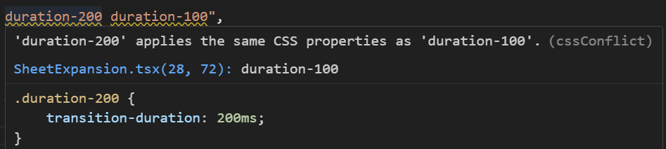
Linter pointing out conflicting classes
- Boost the specificity of the desired value. Be wary of a specificity arms race. If you ever find yourself saying, “I just need to repeat the class one more time” or painstakingly craft a selector, you’ve gone too far.
Below is one such example of boosting specificity, but it comes at a cost of comprehension, as we see “duration-300” listed, but it’s not the one that is applied.
<style>
  .sample2:active {
    transform: translateY(-10px);
  }

  .sample2.transition {
    --transition-duration: 100ms;
  }
</style>

<button class="my-btn transition duration-300 sample2">
  Press and hold
</button>
It’s understandably confusing for readers to disassociate the duration-300 from the effective duration without opening our devtools.
After adopting atomic css for the past couple years, I’ve grown to enjoy being able to construct a styling mental model while just reading the class list. So seeing the duration-300 be a red herring is distressing.
This styling mental model is something I lack for CSS-in-JS where I need to jump around to find the styling of a particular component.
Any downsides to atomic css can typically be resolved with a better component interface.
Transition Triggers
Even with just pseudo-classes we have the ability to create animations beyond the scope of the element being acted upon.
In the next example, checking the “Bump” checkbox will cause a button animation.
<style>
  #sample3-2:active {
    transform: translateY(-50px);
  }

  #sample3-1:checked ~ .my-btn {
    transform: translateY(-50px);
    transition-timing-function: cubic-bezier(.3, 0.2, 0.2, 2.0);
  }
</style>

<input id="sample3-1" type="checkbox">
<label for="sample3-1">Bump</label>
<button id="sample3-2" class="my-btn transition">
  Hold
</button>
Couple of notes:
- Using specificity we’re able to have different transition timing functions depending on the situation. The checkbox uses a different timing function than pressing the button.
- If the juxtaposition of this statement seems at odds with the previous section about how specificity can lead to unintuitive interactions, your intuition isn’t wrong, but I felt this example is important to illustrate how sprinkling in specificity doesn’t always hurt comprehension. It’s a tenent of CSS after all.
- The timing function triggered by the checkbox is an overshoot! It can help give some weight to the interface and make the transition seem natural (a great article). You can play around with different timing functions on the cubic bezier curve playground or right inside your browser devtools.
CSS properties are not additive, so pressing the button while the checkbox is checked won’t cause a 100 pixel translation. If we wanted that behavior we could use custom properties to emulate it:
<style>
  #sample4-2 {
    transform: translateY(
      calc(var(--active-translate, 0px) + var(--checked-translate, 0px))
    )
  }

  #sample4-2:active {
    --active-translate: -50px;
  }

  #sample4-1:checked ~ .my-btn {
    --checked-translate: -50px;
  }
</style>

<input id="sample4-1" type="checkbox">
<label for="sample4-1">Bump</label>
<button id="sample4-2" class="my-btn transition">
  Hold
</button>
We’re just scratching the surface of pure CSS transitions.
Still not everything can be solved with pure CSS. We can sprinkle in some JS so that transitions can be triggered whenever a class is added or removed.
<style>
  #sample5-2:active,
  .bump {
    transform: translateY(-50px);
  }
</style>

<button class="my-btn" onclick="
    document.getElementById('sample5-2').classList.toggle('bump');
  ">
  Click
</button>

<button id="sample5-2" class="my-btn transition">
  Hold
</button>
And only one line of javascript was needed.
Real world examples
What are some real world examples where I’ve used transitions?
Create a navigation sidebar that expands when the user hovers or tabs into the component.
<style>
  div.sample7 {
    position: relative;
  }

  nav.sample7 {
    display: flex;
    position: absolute;
    inset-block: 0;
    padding-left: 8px;
    width: 70px;
    background-color: #065f46;
    overflow: hidden;
    white-space: nowrap;
  }

  nav.sample7:hover, nav.sample7:has(:focus-visible) {
    width: 260px;
  }

  main.sample7 {
    padding-left: 120px;
  }
</style>

<div class="sample7">
  <main class="sample7">
    <div>Some content</div>
    <div>Some more content</div>
  </main>

  <nav class="sample7 transition duration-300">
    <a class="my-btn" href="#">
      🏠 <span style="padding-left: 1em">Go back to home</span>
    </a>
  </nav>
</div>
A toolbar where individual buttons should appear faded so as to not draw the user’s attention to them, but stand out on hover or focus.
<style>
  div.sample8 {
    display: flex;
    gap: 16px;
  }

  button.sample8 {
    opacity: 70%;
  }

  button.sample8:is(:hover,:focus-visible) {
    opacity: 100%;
  }
</style>

<div class="sample8">
  <button class="sample8 my-btn transition duration-100">🏠 Home</button>
  <button class="sample8 my-btn transition duration-100">⚙️ Settings</button>
</div>
How about a progress bar that has a transition whenever its value changes? Warning, this exact example isn’t cross browser compatible (looking at you firefox), so, honestly, you’re better off constructing your own progress bar via the progressbar role, despite what MDN might tell you
<style>
  #sample-progress {
    height: 30px;
    border: none;
  }

  #sample-progress::-webkit-progress-value {
    transition: width 200ms ease-in-out;
  }
</style>

<progress id="sample-progress" value="0" max="100"></progress>
<script>
  window.addEventListener("load", (event) => {
    const progress = document.getElementById("sample-progress");
    setInterval(() => {
      progress.value = (progress.value + 10) % 110;
    }, 350);
  });
</script>
And similar to the sidebar example, sometimes you have a non-modal drawer that contains enough information that the user wants to entirely overlap the content so they don’t need to horizontally scroll. Just know that animating width is expensive with all the layout recalculations, so test on lower end devices to make sure there is no jank.
<style>
  .sample10 {
    position: relative;
  }

  .overlay {
    position: absolute;
    inset: 0;
  }

  .sample10 :where(section) {
    position: absolute;
    height: 100%;
    padding-left: 8px;
    width: 150px;
    background-color: #065f46;
    overflow-x: auto;
  }

  .w-full {
    width: 100%;
  }

  .sample10 :where(main) {
    padding-left: 200px;
  }
</style>

<div class="sample10">
  <main>
    <div>Some content</div>
    <div>Some more content</div>
    <div>Some more content</div>
    <div>Some more content</div>
    <div>Some more content</div>
    <div>Some more content</div>
  </main>

  <div class="overlay">
    <section class="transition duration-300">
      <div>My table</div>
      <button class="my-btn" onclick="
        document.querySelector('.sample10 section').classList.toggle('w-full');
      ">
        ↔️ Resize
      </button>
      <table>
        <tbody>
          <tr>
            <td>Cell 1</td>
            <td>Cell 2</td>
            <td>Cell 3</td>
            <td>Cell 4</td>
            <td>Cell 5</td>
            <td>Cell 6</td>
          </tr>
        </tbody>
      </table>
    </section>
  </div>
</div>
I could probably continue ad-nauseam with examples involving opacity and colors, but I think you get the gist.
To be continued
We’ve only talked about transitions so far, which are simple and yet powerful at the same time, but not everything has only two states to animate or can be emulated with a bezier curve.
What if you wanted an entrance animation, an exit animation, an animation with multiple states, or an infinite loop? This is where CSS animations come into play.
Unfortunately, I’m at time and will need to create an entire dedicated post about animations.
But before we go, know that animation libraries absolutely have a spot in our toolbelts. Out of them all, Framer motion is the slickest and is increasingly capturing the zeitgeist.
Framer motion wins me over when multiple components have a shared animation. The linked example shows a current tab indicator animation similar to MUI tabs, but they are achieved using completely different mechanisms. Conceptually, the MUI tab indicator works by having a single line for the tablist with a transition for when left and width properties are modified on a tab selection.
I understand the MUI tabs implementation. I can’t say the same for Framer Motion. I’ve been looking at it for 15 minutes, scratching my head on how to coordinate each tab’s indicator opacity and translation in such a seamless manner. Dare I say it’s magic? You can see this same Framer motion technique in Aceternity UI’s Hover Effect component, which is just one of the many more motivating demonstrations for Framer motion.
How do you know if Framer motion’s value proposition is worth it:
- Are you not able to accomplish what you want with CSS? CSS is framework agnostic and is able to be copied into non-React projects. It’s one less layer of abstraction to debug.
- Can you deal with the rapid pace of development? Framer motion is on version 11, and may require regular upkeep.
- Are you ok assuming maintainership of Framer motion if it is abandoned or removing it from your site?
As a lover of headless components, I have to admit one of the downsides with them is that one has to reinvent transitions and animations. There are a lack of examples showing how to add animations to libraries like Radix UI, MUI base, Headless UI, and ShadCN. Decorating a UI with animations may be relegated to an afterthought, but remember that animations can not only be beautiful but also meaningful.
And if the choice is between Framer motion (or animation library du jour), and a lack of meaningful animations, then please use the library, just don’t forget about CSS.
Motivation
On a whim, one day I searched “React animation”, and two articles were the top results:
The first article is from 5 years ago and the second article is only a few months old.
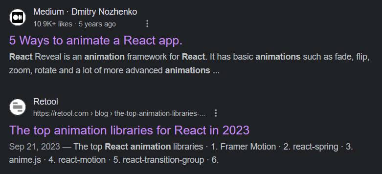
Google search results for ‘React animation’
The intersection of these lists isn’t reassuring:
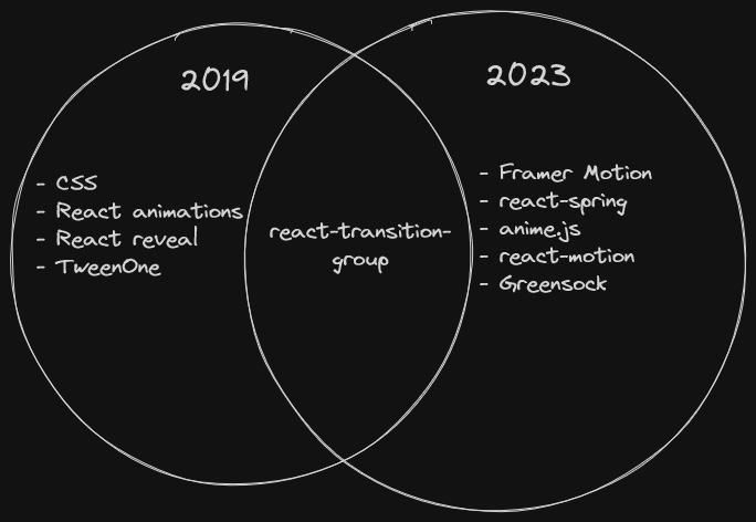
Overlap of React animation recommendations
Our choice is simple, right? There’s only a single overlapping recommendation, react-transition-group.
Well considering this is the first mention of react-transition-group in this article, hopefully the joke is obvious in that choosing the best tool to convey animations in your application can be intensely personal, just see similar reddit threads.
Whatever your decision, may your animations be beautiful, meaningful, and easy to maintain.
Comments
If you'd like to leave a comment, please email [email protected]